Best-in-class low carbon website
Categories
Branding, Creative, Photography, Website
Elements
Give
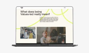
We designed and developed a new brand and groundbreaking energy saving website for mys as part of their brand redevelopment.
The new branding puts mys’ core values of Community, Activism, Freedom and Ambition, and their ambition to ‘do, better’ right at the heart of the new brand identity.
mys is a values-led operator of shared living spaces, and in February 2024 we launched their new, environmentally-conscious brand and website. This marks a significant milestone in the company’s mission as a pending B Corp to actively make decisions that are good for the people, the planet and business.
Colours
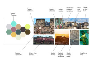
We undertook a great deal of research at We Can to root the new mys visual identity in the landscape and heritage of Edinburgh; the city mys call home. The colour palette we created draws from the historic Flodden Wall, the bog myrtle plant that grows locally, and the blossoming cherry trees on Princes Street from where you can see the castle. Each of the brand elements symbolise mys’ commitment to create spaces that are not only visually appealing, but also full of meaning and purpose.
In a bold move to align the brand with their environmental commitments, we developed a set of environmentally friendly muted colours. This decision helped minimise the carbon footprint associated with the website by using less energy to display it and less ink coverage when producing marketing materials. Part of mys’ bold ‘do, better’ philosophy, this decision reflects their belief in making choices that benefit people, the planet and the business.
Carbon and energy savings
As part of the website build, we also developed a new method of reducing images whilst creating a ‘brand filter’ in the process. To achieve this, we created a template whereby every other pixel is replaced by pure black, and subsequent pixels are overlayed by a white semi-opaque layer to reduce the contrast. Once exported this more than halved each image size, helping to reduce the server load when the website is loaded. Other small server-saving tricks were also tried and implemented by our developer.
Further to the colours, the category-leading rating of A was achieved by ensuring white had no place on the digital assets (white fires up all three LEDs in the screen at 100%).
Purpose
Purpose is genuinely at the heart of mys – so we created a design feature to be woven throughout the brand – the ‘Purpose Thread’. The redesigned logo incorporated it into the ‘y’ in mys, signifying the importance of purpose which weaves through the company’s actions and decisions; the ‘y’ was chosen to do this job, because of their ethos of always asking ‘why (y)’ and questioning how things could be done better. This serves as a constant reminder of mys’ dedication to its values and efforts to make positive change, one small decision at a time.
B Corp
This also comes at a time when mys is celebrating its achievement of B Corp Pending status, whilst continuing to incorporate B Corp principles into the business practice before they qualify for the full B Corp Certification.
Our rebranding is about much more than just changing our look. We wanted to make sure that our values and purpose are reflected in every part of how we run our business
Stuart Henderson
Operations Director at mys group