Rebranding BestFoods – A fresh identity for continued growth
Categories
Artwork, Branding, Creative, Website
Elements
Be active, Connection, Give
We transformed BestFoods’ brand and identity to better showcase their rich heritage, people-centric culture and expertise, to position them for on-going growth and success in the evolving marketplace
The Challenge:
The existing BestFoods brand and website no longer represented how the business has evolved over the past few years, who they are today, or their unique story. The brand needed re-positioning to reflect their place in the marketplace, their heritage and plans for the future. The website also needed a strategic update to support recruitment efforts and attract the talent essential for the company’s continued growth and success.
- The brand and tone of the website didn’t align with their market positioning. It failed to highlight the people-focused nature of the business – people are at the heart of how BestFoods builds and nurtures networks and connections in the industry for their clients.
- The tone of the website didn’t reflect the friendly, approachable nature of the team.
- There wasn’t a real focus on the people at the heart of the brand, or the culture and opportunities for development at BestFoods.
- The visual brand didn’t reflect the rich heritage and unique story of the BestFoods brand.
- BestFoods USP – their ability to offer their clients expertise, access to trusted networks of suppliers, and a compelling offer to candidates – was not effectively communicated.
The Solution:
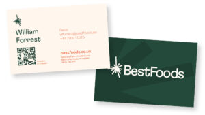
We created a new-look brand identity based on the insight we gained about BestFoods, with a focus on what they offer their clients.
Visuals – we designed a new brand for BestFoods, from the concept “roots to rise” which emphasises their roots as a small startup focusing on bringing the IQF onion to the European market and entrepreneurial spirit that has driven that growth and continues to drive the business. New colours – darker green (with orange highlights) reflect the heritage the brand has.
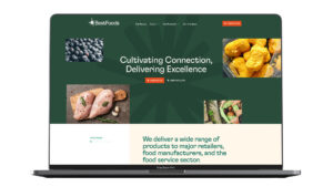
Website – the new website is visually more engaging, and there is a much stronger focus on the people at the heart of the brand. There are fewer pages but more emphasis on the products BestFoods offer, the way that they work with suppliers and clients, and on people & culture. The new site better reflects the nature of the business, their market position and what they offer in terms of people opportunities.
Proposition – we created a new VP that better reflects who BestFoods are, what they do for their clients, and is rooted in growth. “Cultivating connection, delivering excellence” is a reference to both the cultivation of the networks and relationships which BestFoods does for their clients, as well as the high quality of their delivery and approach.
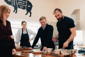
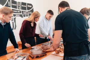
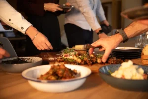
Photography – The new website features up-to-date photography of the team and products that we produced. It highlights the work environment and adds a more personal, human touch to the site.
TOV – We refreshed the tone of voice for the website to capture BestFoods personality – making it friendlier, more human and reflective of the team’s personable nature and approach.
The Results:
The response to the new BestFoods brand and website has been overwhelmingly positive. The refreshed identity has successfully brought the company’s values and culture to the forefront, resonating with both internal and external audiences. While we continue to gather performance metrics, we are thrilled with the initial feedback and look forward to building on the BestFoods story in the coming year.
