Bold Design at Kings Cross Market
Categories
Branding, Creative, Events
Elements
Give
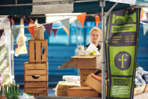
Real Foods needed a fresh, exiting visual identity to accompany the move of their well established Kings Cross independent food market to a new location.
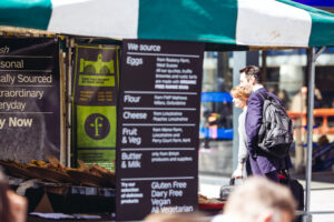
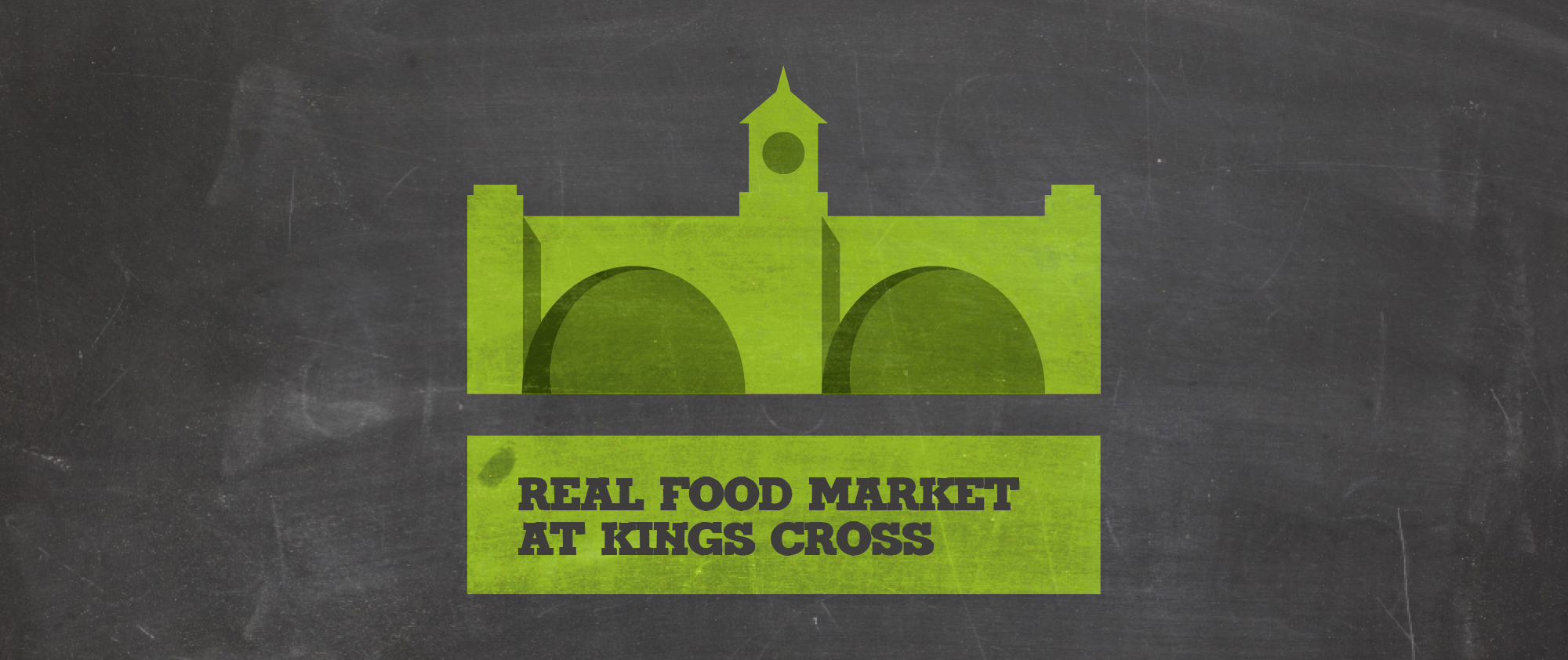
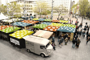
The new identity needed to be exciting and fresh, whilst maintaining consistency with their main brand and recognition for their regular visitors to the market. We investigated both the name and visual identity. Our research showed there was a strong pattern of other markets being named relative to their locale, so it was decided that the market would be named after the location. The identity needed to be bold and enticing, and also needed to be long lasting as it was to be rolled out across stand tarpaulins, hanging banners and signage and marketing materials.
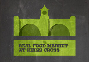
The identity evolved from a stylised illustration of Kings Cross station. It has iconic, recognisable architecture and provided a strong graphic identity, that allowed the Real Foods identity to sit comfortably alongside it. We developed designs for the tarpaulin stall covers, which were designed to create a bright, consistent feel with a random selection of colours. We designed these to show the market details when packed down and stored on site, so when the market was closed people would know when to come back. We also created online materials to support the market to go on the Real Foods website and social media.
We Can Creative have consistently and reliably delivered on creating and developing a range of successful creative concepts for us. This has included re-brands and complete new identities and related collateral material.They always demonstrate a commitment to understanding what we are about, the sector we operate within and what we want to achieve.
Philip Lowery
Real Food Festivals